The mortgage burden

I was reading Bernanke & Gertler's (1995) classic, "Inside the Black Box: The Credit Channel of Monetary Policy Transmission" and was interested in their treatment of the "mortgage burden". Following Boldin (1994) they define it thus: "the ratio of mortgage payments to income for the median new home buyer." I've tried to track down the Boldin article to see this in more detail, but can't find a link

Anyway, I wondered what it would look like for the UK in the lead up to the global financial crisis and asked on Twitter. Neal Hudson kindly shared this chart:

DYpzz8yWsAA0LWQ.jpg


Annual monetary thoughts, 2017

I've not been paying close attention to monetary policy this year - I felt that arguments about the pros and cons of interest rate rises had been done to death, so when the MPC raised to 0.5% in November it barely registered.

But with uncertainty surrounding Brexit likely to dominate macro policy over the next year, I wanted to present an overview of the monetary foundations. 

CPI has recently gone above the 3% letter writing threshold, and it's trajectory is a concern. 

17cpi.png
17cpih.png

The RPI tells a similar story, although the CPIH seems to show that the main inflation pressures might have already passed through. 

The December Inflation Attitudes Survey has revealed an uptick in inflation expectations, with the median response for 5 years time reaching 3.5%. It will be important to monitor whether policy decisions curtail this view. However other key indicators suggest policy may be too tight.

broad17.png

As the chart above shows broad money (M4ex) growth has steadily fallen since last summer, and current growth of 4.2% is probably too low. Divisia measures have fallen from 12.5% this time last year, to 9.8% now.

Industrial production was at 3.5% in October, stronger than the US but weaker than the Euro area. 

NGDP growth is currently 3.4%, suggesting that the back end of 2016 wasn't a return to consistent ~4% growth but more of a blip. This is a big concern and if it falls below 3 the Bank of England should take note. 

17ngdp.png

So what's the implication for interest rates? My rough estimate of the natural rate is currently 2.1%, whilst a classic Taylor rule suggests rates should be 4.6%. So policy rates still feel artificially low. But if inflation is passing through, and AD continues to fall, choppy waters may lie ahead. 

The natural rate and EMH

I've just read an interesting paper by Philip Pilkington (then of Kingston University, now of GMO), called "Endogenous Money and the Natural Rate of Interest: The Reemergence of Liquidity Preference and Animal Spirits in the Post-Keynesian Theory of Capital Markets". In it, he argues that the concept of "a" natural rate of interest implicitly assumes that the EMH holds.

This is a post Keynesian perspective, resting on Keynes' view that there was no single rate of interest that would bring the loanable funds market to equilbrium. Rather, there's a multitude of interest rates that exist throughout the market. One might think that the risk-free rate serves as a benchmark upon which other rates relate, however these rates require a risk adjustment. Pilkington's point is that in order for savings and investment to be equal, "every lender is pricing in the risk of the borrower correctly - i.e. they are lending to the borrower at the "correct" or "natural" rate of interest given this specific borrower's risk". He goes on to argue that this requires an assumption that lenders are perfectly rational and have perfect information. If this isn't the case, he says, there's no reason to expect the natural rate to "channel investment in a manner that ensures a stable equilibrium growth path".

What caught my eye was a footnote where Pilkington points out a perceived contradiction amongst Austrians:

One might note the superficial similarities between what we have just described and the boom-bust cycle of the Austrian Business Cycle Theory (ABCT). The key difference, however, is that the ABCT assumes that only central bank action can affect the money rate on interest. As we have seen, however, unless we assume perfect foresight on the part of savers/investors there is no logical reason to assume that they will set the money rate of interest in line with the natural rate. It would be interesting to consider how Austrian theorists, who generally recognize Knightian uncertainty as being operative in capital markets, would respond on this point. The only viable response to this so far as we can see is to advocate some form of the EMH and rational agents, but if Austrians were to do so it would no longer be clear what would distinguish them from, for example, New Classicals.

The Austrian point is that expectations don't need to be rational (in a RatEx sense) for there to be a tendancy towards equilibrium. The Austrian point is that the "saving" in the loanable funds market is - to paraphrase Roger Garrison's terminology - "saving for something". It thus bridges short run and long run models.

Keynesians emphasise the capacity for saving to not find its way into investment (i.e. the paradox of thrift can occur), whereas classical growth theorists argue that all unconsumed resources are necessarily channelled into investment uses. However the  critical difference between these views is simply the time scale: in the short run Keynesians are right, in the long run the classicals are. But the Austrian approach finds a convenient middle ground. Higher saving (because it's driven by a purposeful reason) means greater future consumption and therefore greater profits for entrepreneurs that ready those resources. Rather than implicitly rely on an assumption of Rational Expectations, this fully captures the radical uncertainty that characterises entrepreneurial decision making. Indeed this is precisely why disruptions to the natural rate (i.e. signal extraction problems) matter. I think the Austrian position is robust on this. The middle ground is solid.

For more on my take on the differences (but also similarities) between Austrians and the New Classicals, see here.

Taylor rule calculator: UK rates should be 4%

When I teach introductory classes on monetary economics, I follow Fernando Nechio's simplified version of the Taylor Rule:

Target rate = 1 + 1.5 x Inflation – 1 x Unemployment gap.

It is easy to remember and provides a decent back of the envelope. I've been looking for a decent online applet, and came across a script from Don't Quit Your Day Job. It nicely integrates with current data, allows you to adjust the coefficients, and shows everything on a chart (recent monetary difficulties are clearly expressed by the fact that the Taylor rule never drops below zero).

A recent WSJ article by Michael Derby (h/t Mike Bird) uses a tool from the Atlanta Fed to claim that rates for the US should now be 2.5% - 3% under a Taylor Rule. A very nice aspect of this is the ability to tweak the estimate of the natural rate (conventionally, but arbitrarily, set to 2%). Using a Laubach-Williams model this reduces the Taylor rule to just 0.72%, which is below the current Fed Funds target (see chart).

The classic version of the Taylor Rule (the one I use in my textbook) is as follows:

i=r+PT +a(PPT)+b(YY)

Using that, a current estimate for the UK is 4%:

You can download the spreadsheet here.

Visualising the price swarm

In his 1994 RAE homage to Arthur Marget, John Egger invokes the image of a price "swarm", as opposed to an overall level.

[t]here is no logical reason why a picture of changes in the height of a given "swarm" could not be obtained by simply plotting the individual prices in such a "swarm", and then generalising concerning the movements of the "swarm" on the basis of the picture of the movement of individuak prices thus obtained (1942, p.333)

I'd hoped that the Billion Prices Project would utilise some awesome Gapminder style visualisation tools to bring the swarm to life, but so far I've not seen any attempts. I was looking at the April CPI data though and figured I'd plot the breakdown. The chart below shows the all 12 inflation sub indices from Feb 2016-March 2017 (2015=100). The overall CPI level is shown as a line:

It's a start.

MA vs. M1

MA has been a work in progress for some time, and so the usefulness in terms of telling a distinct story to other, alternative monetary aggregates, also changes. When I present the current version (but using data as of December 2013) I point out that it's roughly the size to M1. And indeed from 2009-2013 the growth rates have been pretty much the same. Which begs the question as to whether it has any additional explanatory power.

The chart below shows MA vs M1 growth going back even further though, and you can see some major differences. In particular in early 2008 MA started to contract however M1 growth skyrockets.

Given that my motivation for pursuing MA was that traditional aggregates weren't demonstrating a monetary tightening during the 2008 credit "crunch", this is an important point of difference. The trouble with narrow measures are that they are susceptible to reclassifications and data adjustments. That's probably what we're seeing here, but it's also evidence that MA and M1 tell different stories.

CPIH to replace CPI as UK inflation target

The ONS recently announced that the UK inflation target will effectively switch from CPI to CPIH. There's pros and cons to all inflation measures, and generally speaking a movement towards broader financial assets (such as housing) seems sensible. One concern, however, is the potential for changes in the inflation target to impact the monetary stance.

For example, from 1997 to 2003 the target was the Retail Price Index (RPIX). For most of this period, it was below the 2.5% target but was elevated throughout 2003, and by November hit 2.9%. Ordinarily, this would be a sign that monetary policy should be tightened, and that inflation was too high. However the CPI was only growing at 1.4%, significantly below the new target of 2%. All of a sudden, purely due to the change in policy, monetary policy appeared too tight. This became a non trivial driver of looser monetary policy.

The stylized facts of the crack-up boom

The Austrian boom phase provides the “illusion” of growth and there are structural reasons why it must unwind. As distinct from other schools of thoughts that rely on amorphous channels of “confidence”, the Austrian story contains the seeds of recession within the boom. To sum up the theory in a nutshell:

“True, governments can reduce the rate of interest in the short run. They can issue additional paper money. They can open the way to credit expansion by the banks. They can thus create an artificial boom and the appearance of prosperity. But such a boom is bound to collapse soon or late and to bring about a depression” Mises (1944) p.251

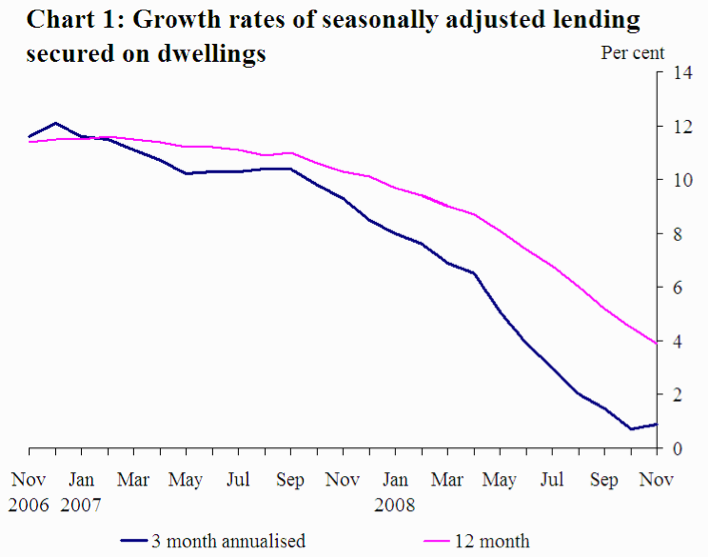
ABC rests on the claim that artificial credit expansion leads to unsustainable investment projects. Easy money and subsequent low interest rates encourage firms to borrow money and invest in interest-sensitive projects, and for consumers to consume rather than save. As Garrison (2001) points out this causes the economy to pull in two directions at once: cheap credit is fuelling malinvestment, whilst strong consumer demand leads to over consumption. The typical assumption is that this “tug of war” over the stock of real resources tends to be “won” by the business sector, because they are closer to the source of credit creation.

The problem stems from the separation of credit and prior production (i.e. savings). Credit allows us to draw upon expected future income streams; therefore if we use credit to fund investment we are anticipating that the value of those future goods will exceed the interest costs of the loans. But note that if we draw upon future income for present consumption, we’re merely engaged in capital consumption. The problem occurs when we systematically overestimate future incomes, and borrow against future income/profits that doesn’t materialise. Since the interest rate is the signal that provides coordination over time, Austrians tend to focus on the manipulation of it as the cause of these clusters of errors.

When outlining the stylised facts of an “Austrian” business cycle it is again necessary to be wary of the hindsight bias – having recently “experienced” a boom-bust cycle it would be tempting to claim too much. Indeed the intention of this post is not to explain every detail of the cycle, but instead to draw upon the “stylised facts” and compare them with real events. This section of the article is not theoretical, and therefore it is possible that competing explanations also provide a “fit” for the data.

Since most work on the Austrian business cycle theory is academic, there are surprisingly few accounts that commit to outlining how markets will look at various stages. However if this post sought to distil and/or blend existing work it would increase the potential for taking a selective view. Therefore the paucity of literature will be embraced, thus making it easy for readers to verify for themselves that this is a faithful and complete recounting of the sources used! I will rely on two main sources, each providing slightly different points of emphasis. I may be accused of being a little biased, and I can take that. This is, after all, my creed.

“I say “creed” because, for brevity, it is purposely expressed dogmatically and without proof. But it is not a creed in the sense that my faith in it does not rest on evidence and that I am not ready to modify it on presentation of new evidence. On the contrary, it is quite tentative. It may serve as a challenge to others and as raw material to help them work out a better product” (Fisher, 1933 p337).

Oppers (2002) will be used to provide the underlying contours and general description of what Austrian’s might expect to be occurring. Skousen (1988) will be utilised to make specific claims about key indicators and asset classes.

Phase A: The inflationary boom

During the boom it will not be clear that there is a problem, since superficially the main economic indicators will suggest that the economy is running smoothly – there will be robust increases in economic output, low inflation, and strong confidence. Oppers (2002) points to three issues that would concern Austrians, however:

  • “Strong investment demand in particular sectors (this could lead to stronger than warranted building up of production capacity)”
  • “An expansion that is driven by strong growth in credit, especially to enterprises”
  • “a diversion of resources away from the production of consumption goods towards capital goods, with an associated rise in consumer goods prices relative to those of capital goods”[5]

Following Skousen (1988) we can generate four empirical generalisations:

            A1: an increase in the money supply


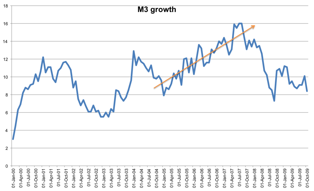
It is this that drives the cycle, and is what pushes the interest rate below its “natural rate”. The fact that capital-intensive industries are stimulated leads to two related observations:

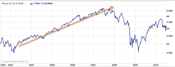
            A2: a rise in corporate profits and

            A3: a stock market boom


Finally,

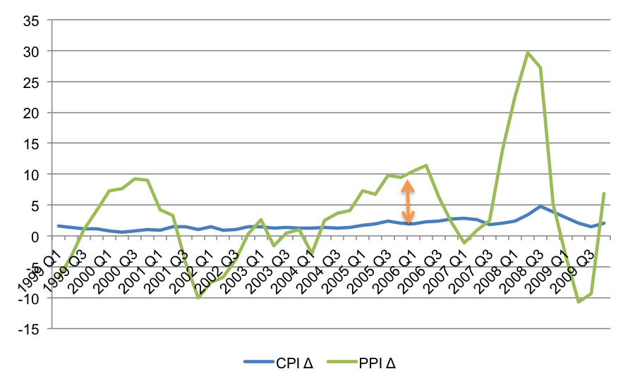
            A4: the producer price index rises faster than the consumer price index

 Phase B: The credit crisis

The credit crisis itself might be considered a “moment”, however we can attribute several observable events to this phase of the cycle. This is the point at which “earlier malinvestment becomes apparent” (Oppers 2002), or where the “illusion” of growth is revealed. Again, Oppers (2002) provides commentary:

  • “a capital stock that is badly matched to the structure of demand”
  • “excess capacity in certain sectors, and a lack of capacity in others”
  • “the slump would likely also be felt strongly… in the banking sector, which would see its loan portfolio deteriorate, as highly leveraged investment projects undertaken during the boom prove to be unprofitable”

According to Skousen (1988) this phase of the boom will manifest itself in the following ways:

            B1: The consumer price index begins to catch up with the producer price index


This leads investors to flee into inflation hedges, leading to:

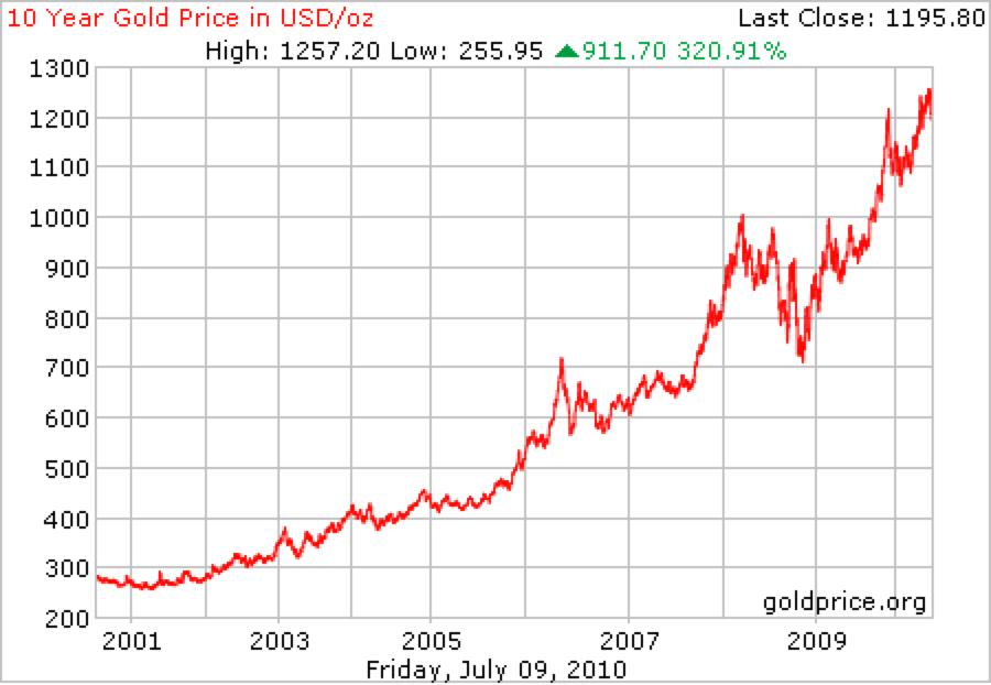
B2: A rising gold price

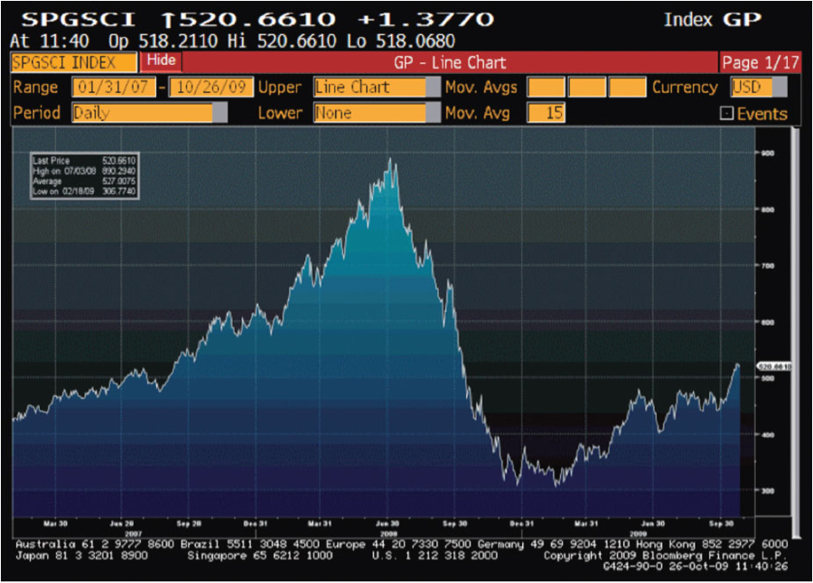
B3: A rise in the price of commodities


The fourth impact will be

            B4: Rising pressure on interest rates 


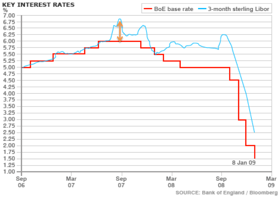
And this stems from two forces. On the one hand the manifestation of consumer price inflation will likely lead to policy responses from the central banks. Also, higher interest rates will reflect the fact that banks seek to call in loans to preserve their balance sheets, reflecting

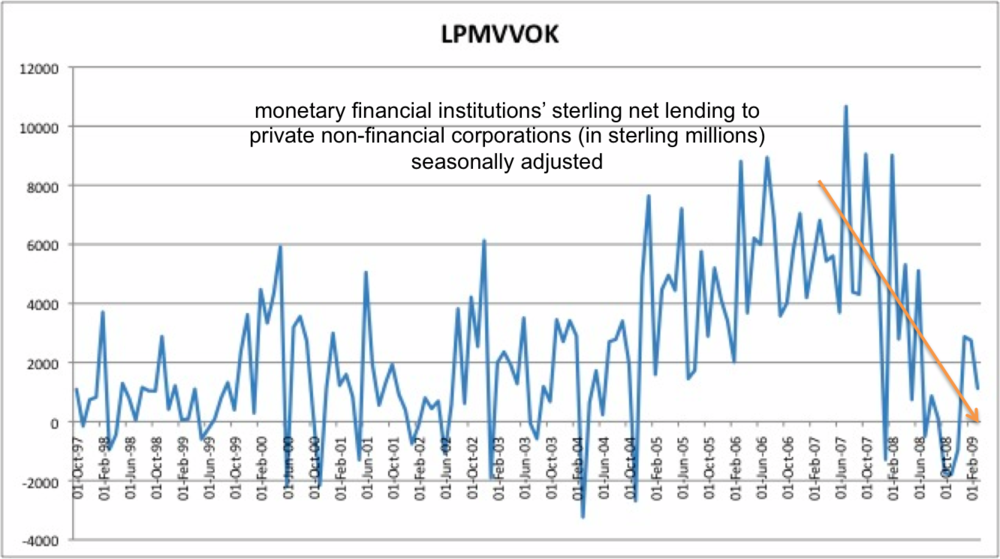
            B5: Banks and corporations scramble for funding


Phase C: The recession

During the recessionary phase the policy debate comes to the fore, as Oppers (2002) writes:

  • “they [Austrians] see demand-stimulating policies after the cyclical peak as merely postponing (and thus potentially aggravating) the correction of past excesses”
  • “an economy in recession does not respond well to expansionary monetary and fiscal policies”

However the recession itself is a fairly unambiguous phenomena, and we would expect to witness typical economic indicators:

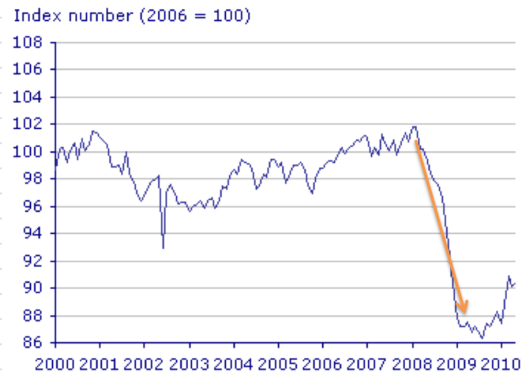
            C1: Production of capital goods falls more sharply than consumer goods. (There is evidence that activities furthest from consumer spending were more severely affected by the recession. Whereas the service sector saw a year on year decline of 3.1%, industry fell by 12.5% whilst construction fell by 13.2% (Giles, C., and Pimlott, D., “UK economy shrinks most in 50 years” Financial Times, June 30th 2009)). As Hayek says,

“It is the decline in investment (or in the production of producer goods) and not the impossibility of selling consumer goods at remunerative prices, which characterises the beginning of the slump” (Hayek 1932)
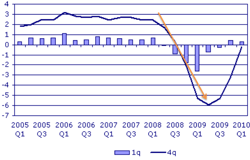
C2: A fall in GDP

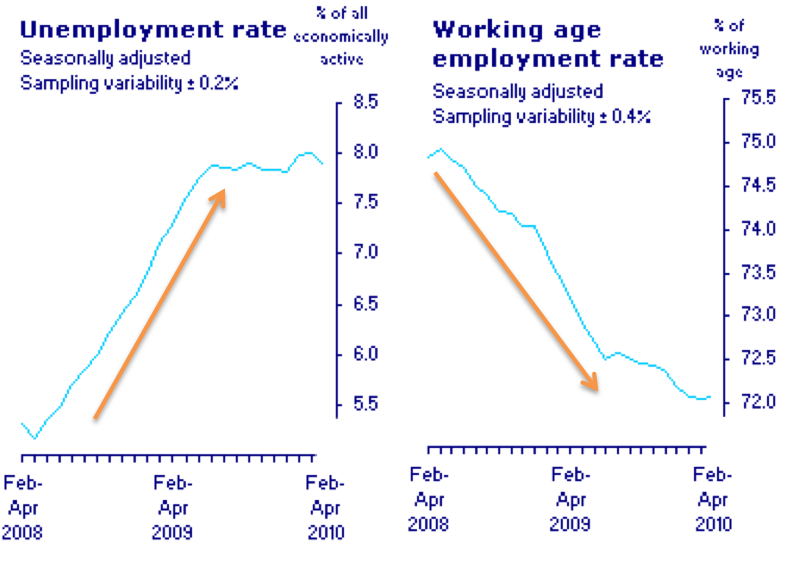
C3: A rise in unemployment

Since the demand for credit declines and central banks engage in expansionary monetary policy we would expect:

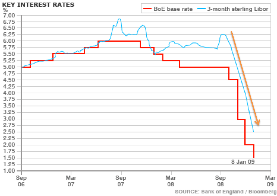
            C4: Falling pressure on interest rates


And finally:

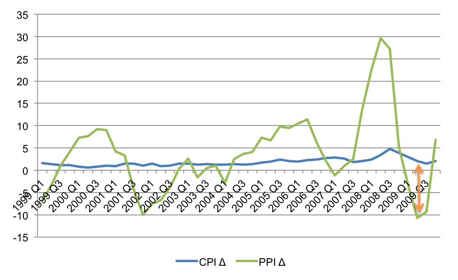
C5: The producer price index falls by more than the consumer price index

We can also draw upon Fisher’s (1933) debt-deflation theory sand outline 9 stages of liquidation. These are, (i) distress selling; (ii) reduction in velocity of deposit currency; (iii) fall in the price level; (iv) fall in the net worth of businesses; (v) fall in profits; (vi) reductions in output and employment; (vii) reduction in confidence; (viii) hoarding and further reduction in velocity; (ix) fall in nominal interest rates, rises in real interest rates.

Phase D: The recovery

I think that “the recovery” is an analytically distinct phase to “the recession” even if in practice they tend to coincide. However in reality the likelihood that government responds proactively to “the recession” means that genuine recovery is often jettisoned in favour of a return to an inflationary boom. Despite this we may retain a fourth phase – after the adjustment costs have been borne, and the fruition becomes evident.

I find the evidence compelling.

New estimates of productivity norm inflation

The "productivity norm" is the assertion that prices should be allowed to vary depending on changes to the unit cost of production. In quantity theory terms it says that permanent technology shocks that alter real output should be permitted to manifest themselves in inflation. Under inflation targeting, this doesn't happen. Central banks attempt to alter aggregate demand such that P is stable. A productivity norm ensure that supply shocks affect P, but demand shocks do not. This is because aggregate demand (ie MV) is stable. This is similar to advocating an NGDP target of 0%.

In March last year I tried to replicate the chart below, from George Selgin's "Less than Zero":

I'm not sure why the link is dead, but I thought I would try again, and appreciate help from George (although the usual disclaimer applies). Using CPI data (series code D7BT) and labour productivity (A4YM) and rebasing to 1997, I came up with the following:


I used the following formula:

Ideally, one would use Total Factor Productivity but there's only an annual estimate in the UK. The most recent version was released in May, and covers 2014. Using that data, we can see the following:

This tells an interesting story - it suggests that a productivity norm would have permitted a mild deflation in the years prior to the financial crisis, as the UK economy enjoyed productivity improvements. I tend to view the 2008 inflation shock as being the Ricardo effect, and of course it was the coincidence of an jump in prices right when the economy was entering recession that caused central banks to permit a secondary recession. If they had been following a productivity norm then they'd have allowed inflation to raise even higher.

I wanted to have a regular series, and so I've used the quarterly growth figures for labour productivity to will regularly update the data section. It remains a work in progress. 

Thoughts on the savings glut hypothesis

The “global savings glut” thesis was coined by Ben Bernanke in 2005, and refers to the notion that downward pressure on US interest rates was predominantly caused by excess savings in foreign trading partners such as China. One way to view this debate is that it is commonly believed that a countries current account is driving the capital account (i.e. that the latter is the source of financing for the former). Bernanke essentially pointed out the possibility that the causal arrow is stronger in the opposite direction – that strong demand for US assets (i.e. a capital account surplus) was driving the current account deficit.

In their case for the global savings glut thesis, Henderson and Hummel (2008) acknowledge that US interest rates were below their natural rate, but claim that Greenspan’s policy was “tight”. Selgin (2008) responded by downplaying measures of the money supply in favour of the interaction of the money supply and the demand for money. His argument is that if the PY side of the equation of exchange is volatile than so must MV by definition.  Interestingly, The Economist considered this in 2005, using basic IS-LM analysis to demonstrate that an increase in global savings would be revealed as a downward shift in the IS curve, cutting interest rates and reducing output. By contrast a monetary expansion would primarily affect the LM curve, also reducing interest rates but also increasing output. They conclude, that the latter case “seems to fit the facts more comfortably.

This blog post is simply a few fragmented thoughts on the claims made by Hummel, Henderson, and also Justin Reitz. For simplicity I'll refer to their collective position as HHR.

The HHR argument is along the following lines: the Fed only directly controls the monetary base, and it does so to ensure a stable US domestic price level. Since dollars that are held overseas have little impact on the domestic price level we should exclude them. Hummel and Henderson argue that since the ratio of currency to reserves is determined endogenously by the preferences of banks, it is better to focus on the Fed’s control of reserves, and they point out that reserves have approximately been frozen.

They do suggest that in theory one should really focus on the domestically held monetary base, and Rietz proceeds along these lines. He argues that since the currency held overseas has no direct impact on the domestic price level this should not count as evidence against a loose Fed policy. Indeed when foreign holdings of currency is stripped out he shows that the monetary base expanded by merely 2% per year. This supports Hummel & Henderson.

HHR makes an intriguing claim – not only that the Fed has been pursuing a de facto free banking monetary policy (i.e. keeping the base essentially frozen and then allowing fractional reserve banks to expand and contract the money supply on top of that to respond to changes in the demand to hold money), but that this is the true cause of the Great Moderation. No wonder they are surprised that Selgin doesn’t want to take credit for it! Rather, the bit that Greenspan was directly responsible for resembled a Free Banking environment.

But of course the incentive system within the existing regime (e.g. deposit insurance etc) means that the demand for money does not reflect voluntary behavior. HHR would say “but that’s not the Fed’s fault! Blame congress” and I sympathise. But regardless of whose fault it is it is at best an approximate free banking environment, and no one has argued that by resembling a free banking regime on one margin (whilst other margins are non free banking) is an improvement. Again, this comes down to whether you treat the regime as fixed, or expect the central bank to try to use what powers they do have to compensate for problems with the regime.

HHR don’t argue that the Fed didn’t play a role in generating the crisis. They merely show that it wasn’t within their narrow remit to prevent it. In isolation, a Fed that tries to limit its sphere of influence and sticks to approximating a free banking policy is a good thing. But in a world were governments create even bigger errors – whether foreign (in terms of their currency manipulation) or domestic (in terms of their addiction to debt financing) – maybe we should hold central bankers to a higher standard.

Special report on natural interest rates

I've made two previous efforts to calculate the natural interest rate for the UK, and you can find them here:

I've just written a short paper talking about why the natural rate is important, and a (very) brief summary of some recent efforts to estimate it. You download it here (data here). The charts are up through 2015, but I thought it would also be interesting to incorporate it in our data section. The chart belows shows the present situation, and as of 2016 Q2 the natural real rate was 1.8%. Using the GDP deflator as an inflation measure, this implies a nominal rate of 2.34%. With market rates (I use SONIA) at 0.47% this implies monetary policy is too loose.

The lethargic recovery

I was talking today about why I thought the UK's recovery was lethargic, back when we thought that it was (we now think it was signficently better). There's obviously  a number of factors, and I wouldn't paint government policy as the sole determinant. We can split them into 6 main categories:

  • Falling real incomes: Household consumption has been squeezed via low wage increases and high inflation. CPI has been above the 2% target since December 2009 reaching 5.2% in September 2011. As already mentioned huge open ended tax liabilities and tax uncertainty has dampened spending with signs that consumers are factoring future debt burdens into their present consumption choices, “indebted consumers seem more interested in paying down what they owe than splashing out on flat-screen televisions” 
  • Low business confidence: not just because of low demand, but also due to Robert Higg’s concept of “regime uncertainty”. This results from the erosion of investor’s confidence in private property rights, and there is evidence that this occurred in the UK following the crisis.
  • Distressed export markets: since the financial crisis the trade-weighted value of the pound has fallen by about 20%, however 45% of exports go to countries within the Eurozone meaning that the UK is highly dependent on Eurozone growth.
  • Breakdown in financial intermediation: Bank lending has been weak, in large part due to new Basel rules that intend to encourage banks to hold more reserves. Evidence suggests that any gains from quantitative easing were almost totally offset by stricter capital requirements imposed by regulators.  In addition the recession directly followed a banking crisis that resulted in the government nationalising the four largest lenders in the country.  According to Reinhart and Rogoff, “the aftermath of banking crises is associated with profound declines in output and employment” , and the conventional view is that balance sheet repair takes time.  This may especially hold if accompanied by a housing bust – and the UK had one of the largest housing bubbles.
  • Regulatory problems: not only had much of the productive capacity of the economy been hollowed out prior to the financial crisis, there has been little supply side reforms as part of the recovery. The list of regulatory reforms in recent Budgets is underwhelming, treating government investment in infrastructure as being synonymous with supply side growth. Meanwhile airports are constrained by planning laws, housing developers can’t build new housing and small businesses are stifled by red tape.  In addition high marginal tax rates across the tax schedule dampens incentives and hinders growth.
  • Monetary policy mistakes: Similar to the US, interest rates in the UK were kept artificially low in the period building up to the financial crisis creating distortions in the economy. This “malinvestment” sowed the seeds of an inevitable correction, but these problems were compounded by additional monetary policy failures. In terms of the crisis period itself, nominal GDP began to collapse in early 2008 and didn’t reach its pre crisis growth rate of around 5% until late 2010. Some argue that the Bank of England was slow to respond to this – interest rates were 5% in February 2008 and they only began cutting in October (to 4.5%). Quantitative easing didn’t begin until 6 months after the collapse of Lehman Brothers, in March 2009.

In short, there has been a combination of reasons why the UK economy recovered thw way it did. It was vulnerable to a recession and monetary mismanagement compounded fiscal folly. 2008 wasn’t a temporary, irrational pause in spending but a permanent wealth shock.

UK Gross Output grew by 3.49% in 2014

Last month the ONS released the Supply and Use Tables for 2014. You can find them here. They are interesting because they provide a measure of intermediate consumption, which many Austrian economists - who care about the entire "structure of production" - believe is an important missing ingredient of typical national accounts. Indeed it's somewhat odd that Gross Domestic Product strips this economic activity out, making it more of a Net concept. As Sean Corrigan puts it, we want the Hayekian horse (of production) in front of the Keynesian cart (of consumption).

Mark Skousen has advocated a measure that he refers to as "Gross Domestic Expenditure", which incorporates all of the production side of the economy. A close substitute for this is "Gross Output", which, as I've previously mentioned, is now published by the BEA (Skousen adjusts Gross Output by adding Gross sales at a retail and wholesale level, to incorporate even more business spending).

I've made previous efforts to measure Gross Output in the UK, using the Supply and Use Tables. This time, I'ive modified the method. I think the simplest way to approach it is to simply combine NGDP with intermediate consumption. Doing so provides the following side-by-side comparison:


Similar to US estimates, we see that Gross Output is around (in fact just under) twice as large as nominal GDP. The interesting comparison is the growth rates, and Gross Output is more volatile than NGDP:

In 2006 it was growing at 7.88% which indicated an even larger boom that was being shown in NGDP data (which grew by 5.52%). It then contracted by -2.31% in 2009 before picking up again. As with NGDP the post crisis growth rate seems enduringly lower. My main interest was the 2014 figure, and we can see that whilst Gross Output grew faster than NGDP in 2013, this was reversed in 2014. Whilst NGDP delivered a robust 4.77%, Gross Output only grew by 3.49%.

The problem with offering an alternative to GDP is there's a burden to provide a better one, or a more theoretically robust one. I wouldn't claim that I've achieved that, but I think it's worthy of enquiry. And if the recent debate between Vincent Geloso and Scott Sumner (and Marcus Nunes and Vincent again) is anything to go by, maybe there's increasing interest in getting this right.